Each day, more than 100,000 people in the US visit a Social Security Administration (SSA) office to apply for retirement or disability benefits, register for Medicare, or replace their Social Security card.
So when the federal government recommended closing dozens of SSA offices nationwide early last year, we wondered how closures could affect people’s access to the agency’s more than 1,300 local offices.
To explore this question, we used routing analysis to estimate how many people each SSA office covers and how closing an office would affect travel time to the next-closest office.
Why routing analysis?
People’s access to a service, such as a food bank or SSA office, is more complex than identifying whether their county of residence contains that service or not. People can drive hundreds of miles without leaving San Bernardino, California, and those in Alexandria, Virginia, are just across the border from Washington, DC.
Using routing analysis to analyze people’s access to an SSA office provides a more realistic estimate of their experiences crossing county lines and traveling roads that are rarely straight lines.
In our preliminary work on this topic, we mapped the locations of the 47 offices the Department of Government Efficiency proposed closing to see which areas could be most affected. To illustrate the impact, we used Google Maps to measure how much longer people in a few regions of Montana and Wisconsin would have to drive if the proposed offices closed.
This simple approach served its purpose: Tell a story with representative states that readers could easily read and comprehend. We needed a way to scale the analysis to the entire country, but using precomputed travel times from the center of one census tract to another can miss some important variations and unique edge cases.
With financial support from AARP, we supercharged our original analysis to calculate the number of people each SSA office covers and how much longer people would have to drive if their closest office were to close. For this more granular analysis, we focused on the census tract level, as they’re relatively small areas with about 1,200 to 8,800 people.
How we conducted the routing analysis
To scale our analysis, we used five data sources:
- First, we created a list of all SSA offices using SSA location data. These data include three types of physical locations SSA uses to offer services:
- field offices (about 1,200), which are physical offices that generally offer a full range of services
- video service delivery sites (about 90), which enable people to access services using video conferencing equipment
- resident stations (about 40), which SSA describes as “a very small facility in remote areas, such as at a community center, nursing home, etc.”
- We used the Census Bureau’s American Community Survey (ACS) to identify every census tract, including those in which an SSA office was located. We then used the ACS data to measure the total population in each census tract. This enables us to calculate the coverage area for each SSA office—all census tracts for which that office is the nearest SSA location based on drive time.
We also used the ACS data to total the number of people ages 65 and older and the number of disabled people in each tract—two of the major groups the Social Security system serves. - Next, we used Urban’s internal geocoder tool to identify each office’s latitude and longitude. This internal tool enables us to submit mailing addresses as inputs and receive county, latitude, and longitude as outputs.
Before we could conduct our routing analysis from census tracts to SSA offices, we needed to establish a single latitude and longitude point that would represent each census tract. We pulled population-weighted centroid data for each tract from the Census Bureau to serve as these single representative points.
The Census Bureau describes a population-weighted centroid as the point where a tract would balance if it were perfectly flat and an equal weight were placed at the location of every resident in a tract.
Imagine a square-shaped census tract where everyone lives in the top-right corner and where there is a SSA office in the bottom-left corner (black dot in the image below).
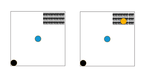
Note: Black dots represent a Social Security Administration office. Blue dots represent the center of the census tract. The yellow dot signifies the population center of the tract.
If we calculated the drive time from the SSA office to the center of the square (blue dot), we would incorrectly calculate the drive time for the average person in the square. Weighting the center of the square by population moves the center point closer to the population center (yellow dot), which gives us a more accurate estimate of the drive time.
Because we wanted to estimate drive time, we also needed to snap the census tracts’ population-weighted centroid to the nearest drivable road. A tract’s exact population-weighted centroid could be in the middle of a field or on top of a building. Most centers only moved a few yards when snapped to a road.
Conducting our analysis at the census tract level best balanced geographic disaggregation and feasibility. Using larger geographic units, like a county, would have assumed all residents lived at its population-weighted centroid, which is unrealistic and wouldn’t have provided enough geographic disaggregation for our granular analysis. Using a smaller geographic scale, like a census block, would have been computationally infeasible within the project’s scope.
- We used Open Source Routing Machine (OSRM), a route-planning software that works like Google Maps, to calculate the driving distance from each SSA office to the population-weighted centroid of each census tract.
OSRM provides a demonstration public-facing API to conduct routing calculations, but the large scale of our calculations far outstripped their servers’ rate limits. Instead, we configured our own local instance of OSRM and used it to develop our distance calculations.
This process generated a large dataset of the more than 108 million potential routes between population-weighted census tracts and SSA offices.
For the purposes of our analysis, we narrowed this further by considering only the 400 closest tracts by Haversine distance to each office and tract-office pairs within 310 miles(500 kilometers). That left us with more than 720,000 routes for tract-office pairs. We used 310 miles because census tracts end up with at least one match and because more than 620 miles of driving would take most people more than a full day.
In the end, some tracts weren’t assigned an office because they were very far from an office or no office was reachable by car, such as the tract containing Catalina Island, which is located about 23 miles (37 kilometers) off the coast of Los Angeles.
Though excluding these areas means overall averages are technically an underestimate, we view these areas as essentially having no access to a physical office and therefore, we would expect those residents to rely on the SSA phone or online systems instead.
Further, our analysis only considers drive time and doesn’t capture travel by public transit, biking, or walking, which would require additional computing time. We expect that travel times for these other modes of transportation would likely take longer than driving, and our analysis doesn’t account for traffic. Consequently, our results are likely a travel-time floor.
With these caveats in place, we then created tract-level summaries with the closest SSA office, second-closest SSA office, and the difference between the two. We also created office-level summaries that define the primary area covered by each office.
Between each neighborhood and office, we measure the straight-line distance (i.e., as the crow flies), the driving distance, and the driving time. All three variables are correlated, but we believe driving durations best represent the experience of people traveling to SSA offices. Many routes near water or in the mountains are winding and differ significantly from straight-line distances.
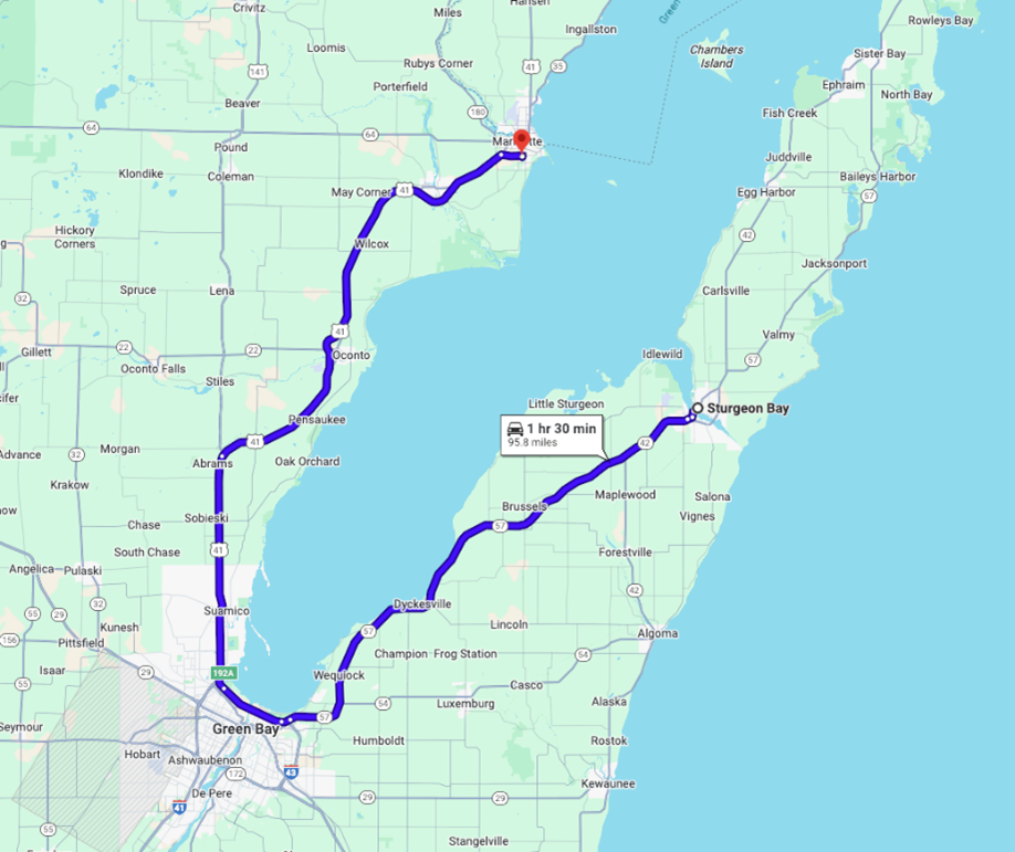
For example, driving from Sturgeon Bay, Wisconsin—on the Door Peninsula north of Green Bay—to the office in Marinette, Wisconsin, requires a 1.5-hour drive around Green Bay. In addition to physical geography, speed limits have a major impact on the lived experience of driving to SSA offices, and only the driving time measure accounts for this factor.
How we used data visualization and storytelling to share our findings
Ultimately, we found the distribution of coverage areas was substantial, with SSA offices covering a few thousand people to nearly 1.5 million people. Overall, more than 80 percent of people live within a 30-minute one-way drive from their local SSA office, but most people live far from their second-closest office, meaning travel times would dramatically change if their nearest office were to close.
With drive time data available for all census tracts and SSA offices, we were faced with the question of how to present our findings in a useful, accessible way for policymakers.
We decided we would not create a census tract–level interactive map of the entire United States. The requirements placed on users’ browsers would be too large to enable them to use that kind of map quickly and easily.
Instead, we decided to create separate static images (PNGs) of each state built in R that the user could view by using a dropdown menu.
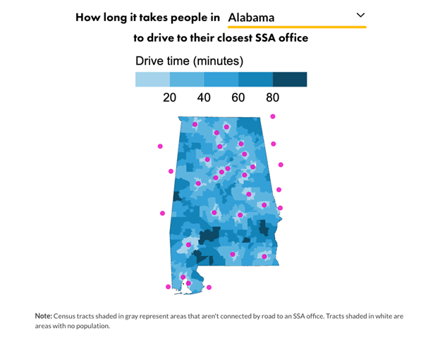
Below each map, we added a table (built in Datawrapper) that shows the SSA office address; which congressional districts it covers; the total population, number of people ages 65 and older, number of disabled people it covers; and the average drive time to the next closest office.
On both the map and in the table, we include offices that aren’t located in the selected state because people can visit SSA offices located outside their state. We did not include the tracts in those neighboring states on the map to maintain the familiarity of the state shape.
In addition to a data tool, we also used storytelling to communicate the potential effects of SSA office closures. To help make our findings more tangible, we decided to focus on a single representative state, rather than summarize trends by region.
We settled on North Carolina as our example for two main reasons: First, in July 2025, the Associated Press reported that SSA was planning to close around 30 offices across the country—4 of which were located in North Carolina.
Second, North Carolina has a mix of rural and urban areas, as well as a mix of very short drive times (particularly in the urban centers) and very long drive times (particularly in the mountainous western part of the state and the eastern coastal areas) to reach an SSA office.
We also compared drive times in the state with those in rest of the country by showing distributions of average drive times and a table of the 10 offices with the most populous coverage areas.
Together, the tool and accompanying story can help federal, state, and local policymakers understand not only current access to SSA offices, but also how potential closures could affect their community’s access to critical retirement and disability benefits.
You can explore our data further in the Urban Institute Data Catalog.